World Bank Data:
K-Means Clustering
The point of this project was to explore the data mining procedure from the data preprocessing to applying various mining algorithms
The Data Set:
The World Bank contains a massive amount of data ranging from economic statistics to education statistics of nearly every country in the world. For the purposes of this project, I selected a couple of different statistics and decided to combine them to create my own data set.
I decided to take life expectancy and literacy rate data for each country and combine it into a data set. Here is a snapshot of the excel sheet containing that data:

Although not terribly complex, this data set was perfect to play around with in terms of data mining algorithms and strategies. When I obtained the data, some records were missing for some of the countries. I decided to eliminate those records that contained missing information rather than interpolate or include the records.
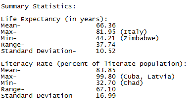
Once the data was trimmed up and in a decent format, I decided to collect some summary statistics using excel:
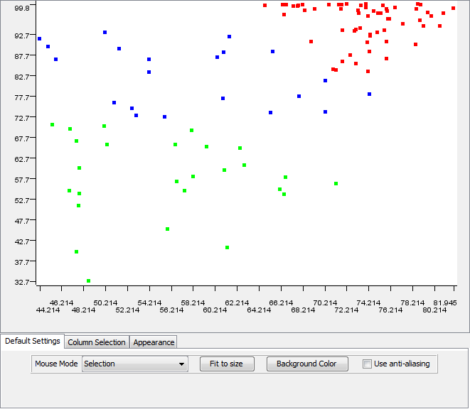
The following image is a quick plot of the data points:

Each of the data points represents a country. We have the literacy rate on the vertical axis and the life expectancy on the horizontal. The data shows a rough linear correlation, but not enough to be convincing.
Objective:
After looking at the data, I decided that my goal was to see if life expectancy and literacy rates within countries had any kind of connection. In addition, I wanted to see if certain groups of countries existed with similar attributes.
Applying the Algorithm:
I decided that running clustering algorithms would give the most interesting results for my particular goals. To aid me in my quest, I chose to use Knime, an open source visual data mining tool.
Knime afforded me with a variety of clustering algorithms. My first move was to create a simple workflow using a k-means clustering algorithm:
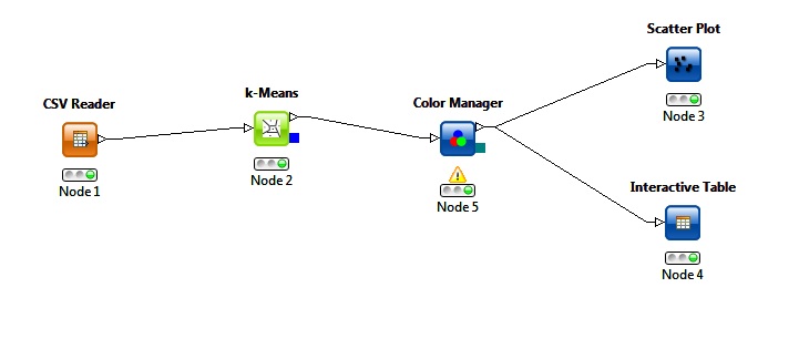
The above workflow applied a k-means clustering with three centroids. It passed through a color manager and produced the following scatter plot:
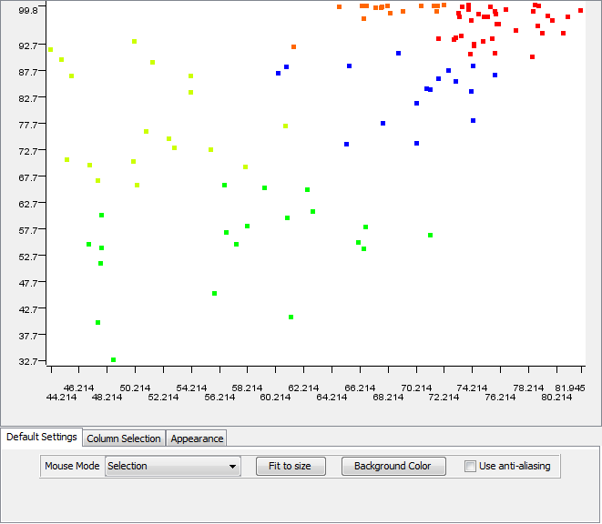
Examining these results proved that the clusters consisted of similar countries. However, I felt that a better desciption of the data set would result by increasing the number of clusters. I ran the k-means algorithm a few more times while changing the amount of centroids. Here are my results from four clusters:

Here are the results of five clusters:
I decided that the k-means clustering using five centroids produced the best results. I examined the results with Knime's interactive data table. I was able to distill which countries belonged to which cluster. Here are the countries listed from the red cluster:
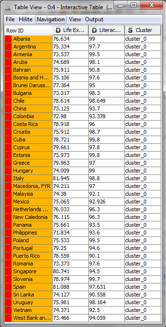
Green Cluster:
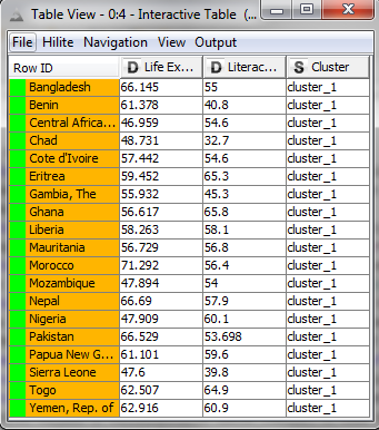
Blue Cluster:
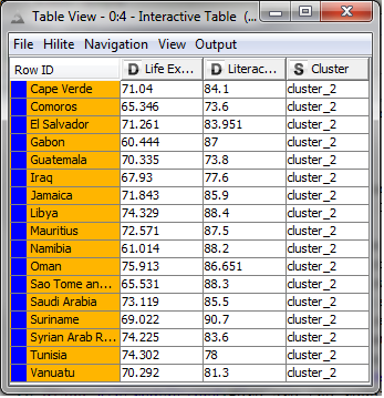
Orange Cluster:
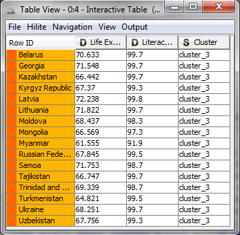
Yellow Cluster:
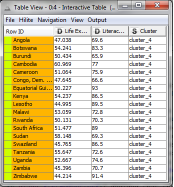
I noticed a few interesting things within the clusters; for instance, many Eastern European countries fell into the orange cluster having high literacy, but slightly lower life expectancy. In addition, most countries in the yellow group are from Africa.
I also decided to experiment with other clustering algorithms to see if they would yield any better results. The following image is a result of trying a heirarchical clustering approach:
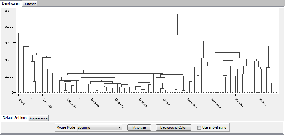
The dendrogram that Knime produced was a little harder to distill information from, but it placed similar countries next each other. I think that using k-means with color coding was the most effective approach to visualizing the relationships.
Conclusion:
This project was a great way for me to get my feet wet in the process of data mining. I was able to obtain a data set, preprocess the data, apply a clustering algorithm, and yield some kind of results. In addition, I gained experience using Knime to create a workflow to mine my data.
My future plans involve expanding upon the data set used in this project. My goal is to add some more attributes to each country and reapply clustering algorithms. I would also like to assign each country to a region, and create a classification method for adding new countries to the data set. Finally, I would like to explore more ways to visualize clustered or classified countries, like on a map for instance.